Send


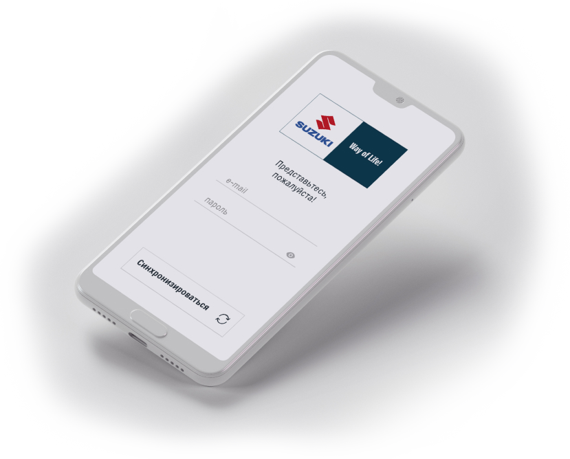
Suzuki came up with an interesting task. They wanted a mobile app for field surveys right after test drives in dealerships. The challenge was that it had to work really quick.
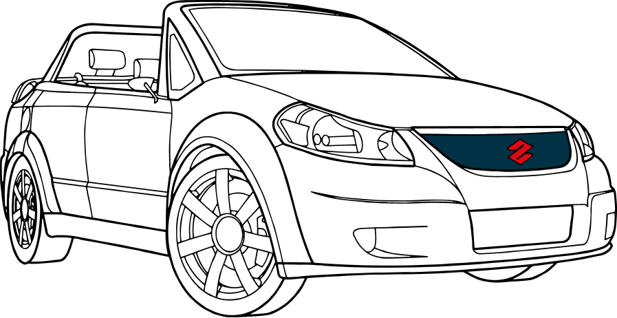

Surveys were supposed to take place in dealerships right after test drives.
We assumed that drivers had little to no time to answer questions. Another thing was that the staff in dealerships had no user experience. Therefore we decided that it should look really simple.
We assumed that drivers had little to no time to answer questions. Another thing was that the staff in dealerships had no user experience. Therefore we decided that it should look really simple.
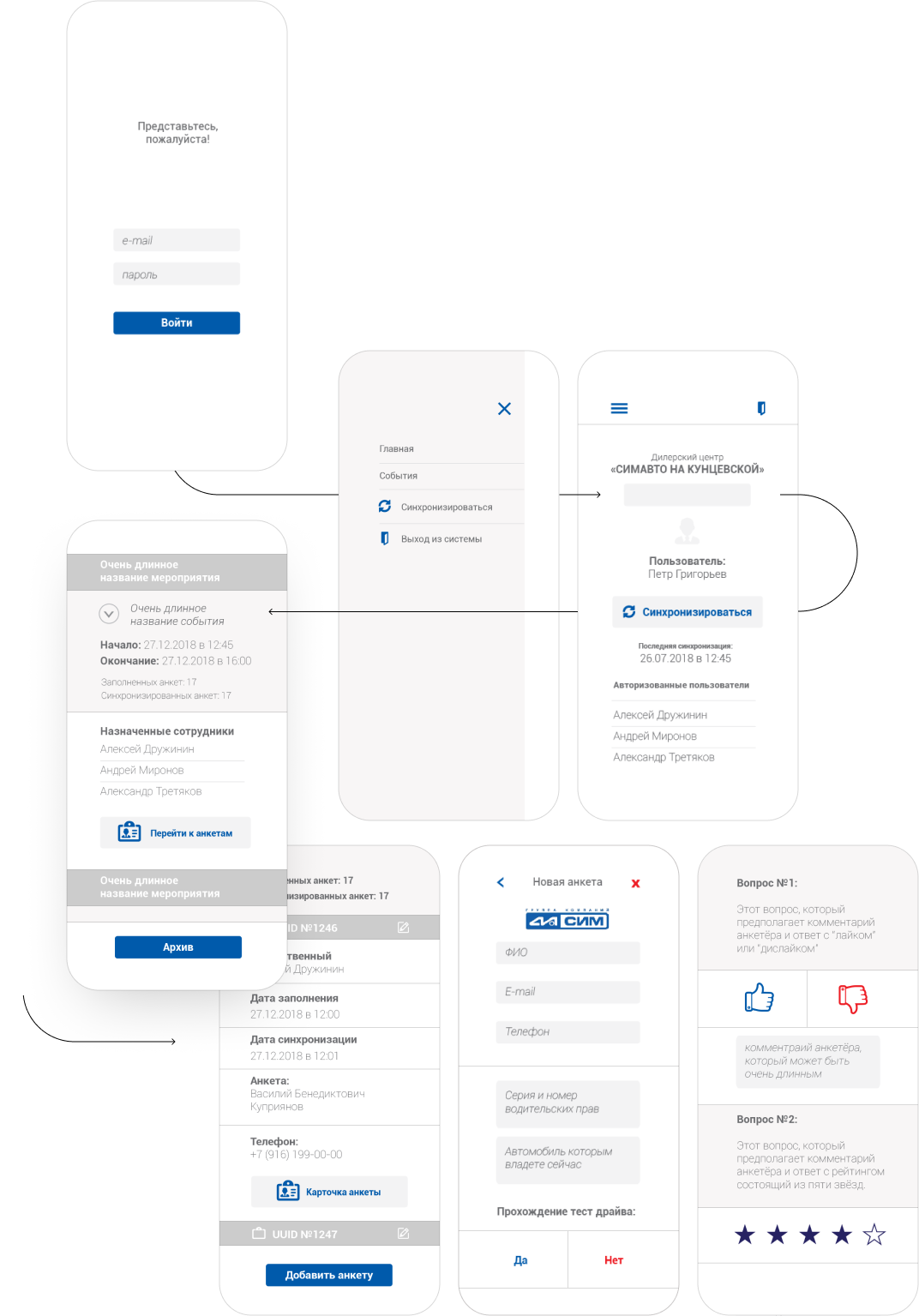

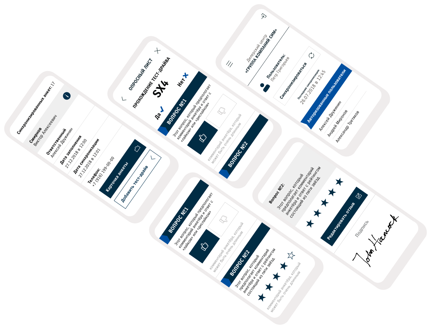
We chose classic architecture with side menu. And made user flow linear. App had to consider dealership, driver's full name, their driving experience and if they had a car at the moment. It also included a tool to evaluate their experience from driving any given brand.
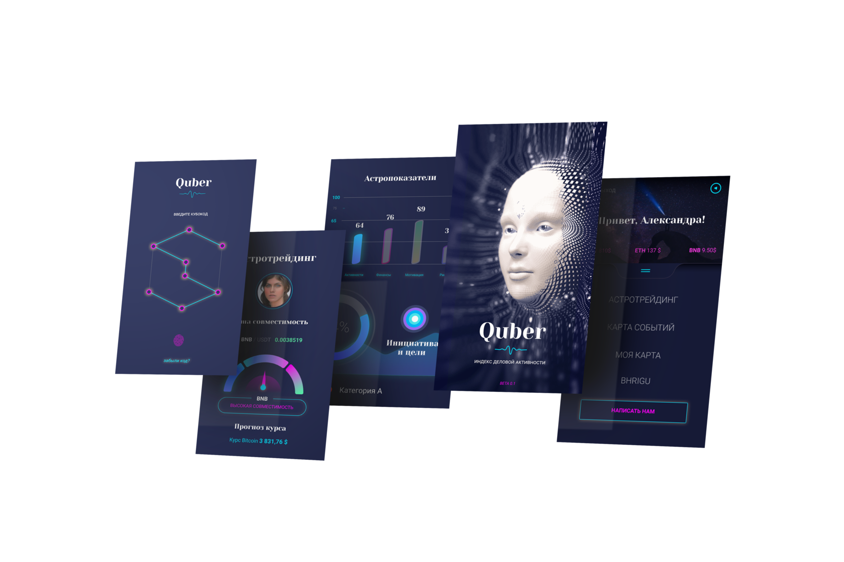
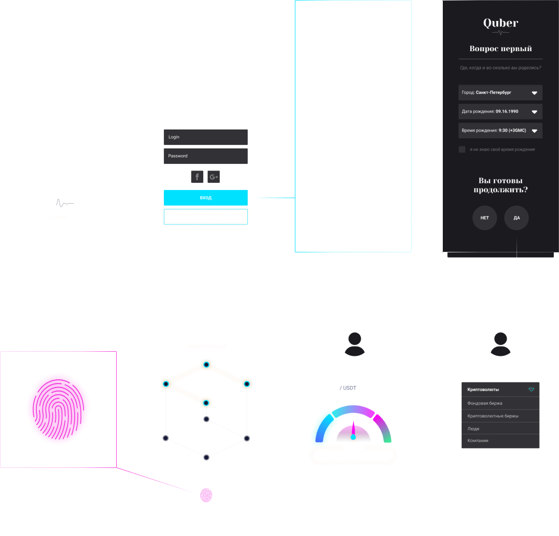
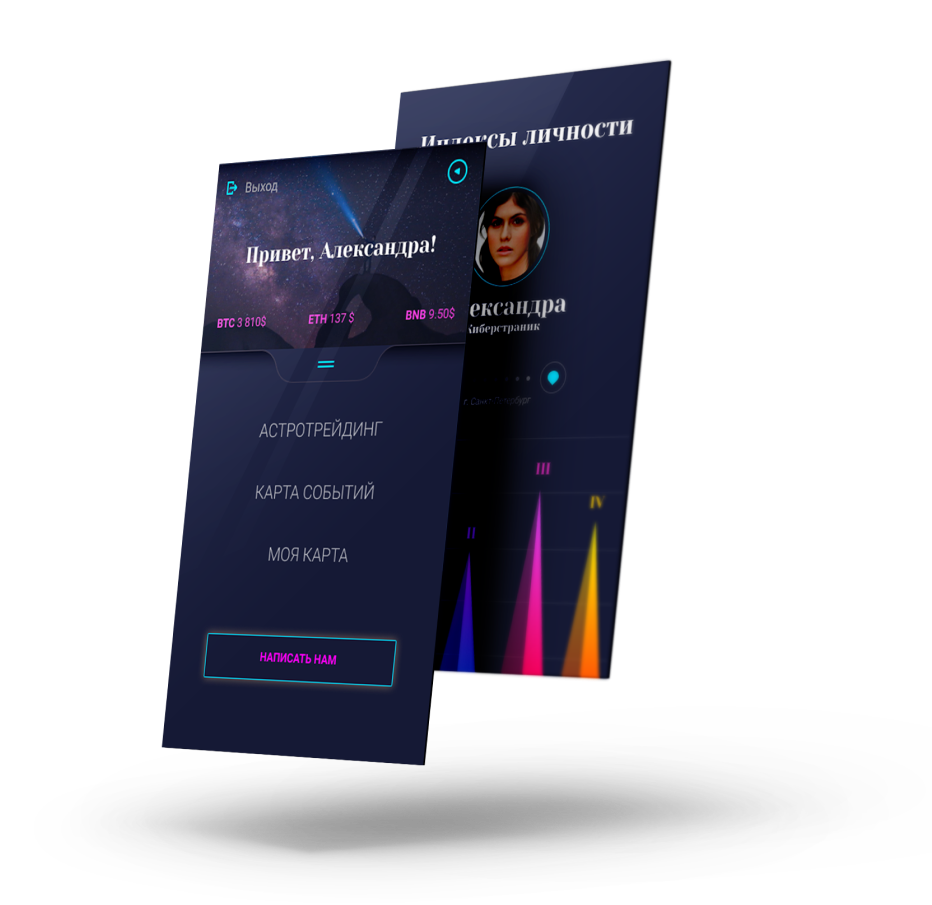
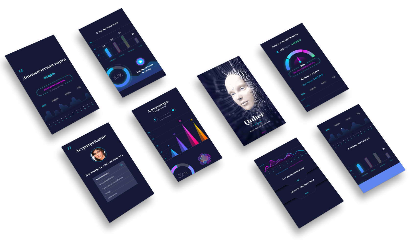
We are pleased to tell you about our Bhrigu project, which includes the service that you are currently using Quber.
Quber is part of the ecosystem that we create for people for whom artificial intelligence and astrological (and not only) prediction techniques are fundamental.
Quber is part of the ecosystem that we create for people for whom artificial intelligence and astrological (and not only) prediction techniques are fundamental.

Geospace Service for determining the strategic material and spiritual goals of human life. Our goal is to make such a tool publicly available.

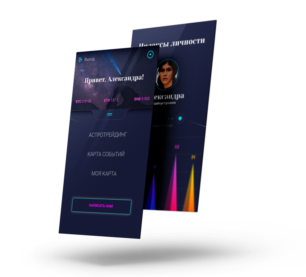
Geospace Service for determining the strategic material and spiritual goals of human life
Our goal is to make such a tool publicly available





Math brain
booster
games
booster
games
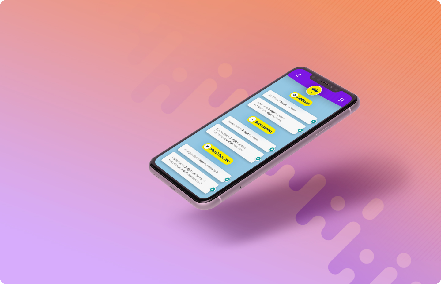
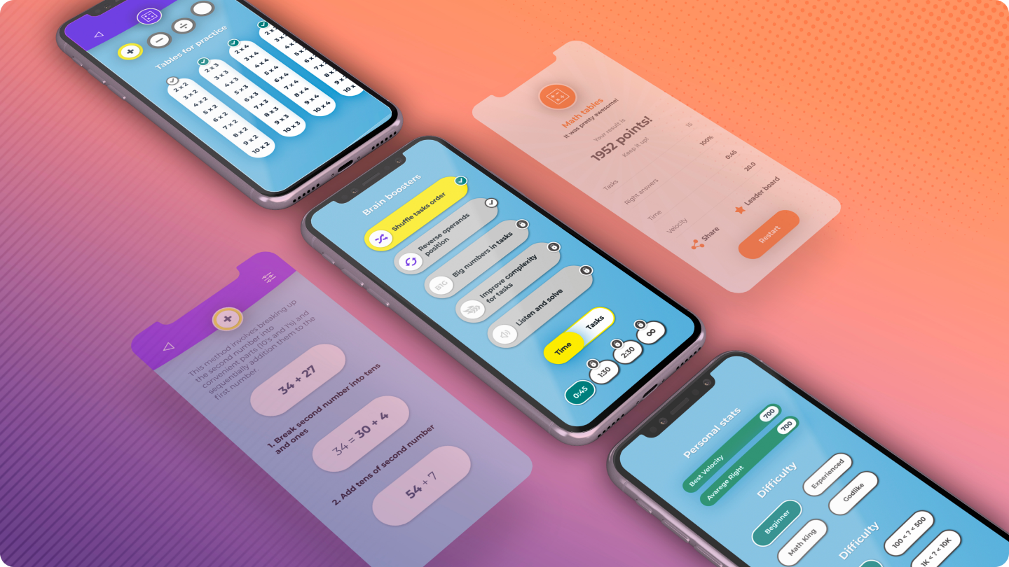
Arithmetic app for training memory, attention and logical thinking. Based on simple time-limited tasks

When a person solves simple arithmetic exercises on the rate, in the cerebral cortex are utilized areas which responsible for
Therefore, the more a person does these exercises, the more he develop his mind & his mathematical skills.
MEMORY
ATTENTION
LOGICAL THINKING
ATTENTION
LOGICAL THINKING
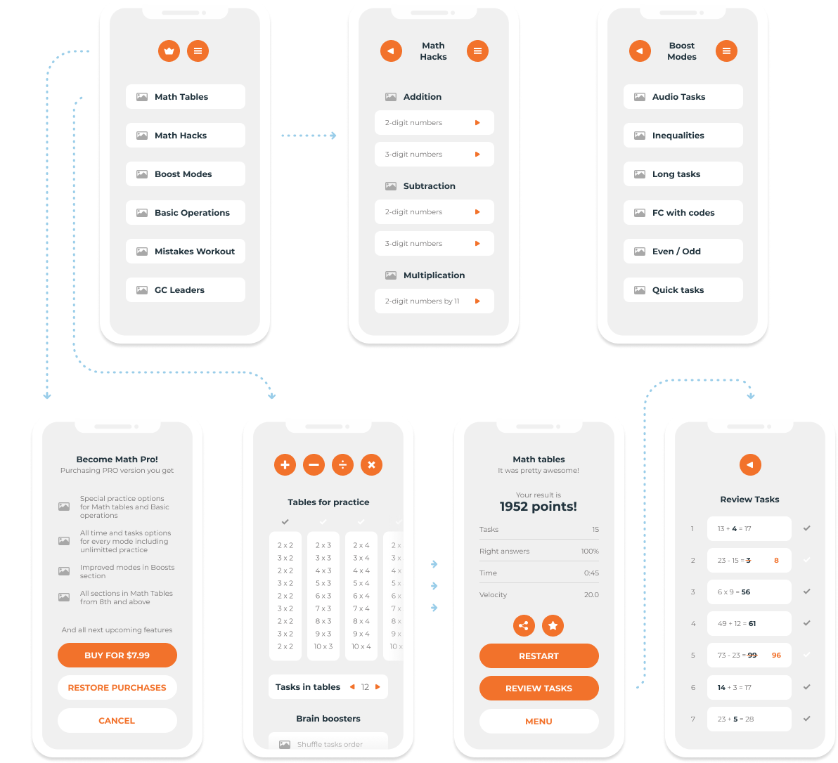

With this app you'll improve ATTENTION, REACTION and VELOCITY of mind
